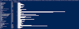
I set about modifying the function to my liking and ended up with the following changes:
- Removed color-based conditional formatting for readability and ease-of-use
- Modified the output to be object-based
- Added ability to specify columns to keep
The first modification ended up being more of a usability issue for me. My use-cases did not require changing colors of the graph and by removing this functionality, we reduce the complexity of the script and the number of mandatory properties. Also, with the script leaner, it made my next tasks much easier.
In the process of updating the script, it became clear that meeting my requirement of retaining properties would also require returning objects instead of writing to the host. After editing the code to maintain the objects passed into the function, it was simple enough to convert the Write-Host of the bars in the chart to instead add a new property with the bar as a string.
Once we had all of that code modified, I quickly realized that the more properties we specified and the greater the width of them, the less space we had for charting. That's the exact opposite of the problem I originally had; now there's TOO much data! By implementing my original requirement of being able to specify columns to keep, we are now actually restricting the data so that we can provide more helpful charts.
With the function complete, we can do fun things like chart the top 10 memory hogs:
The Out-ConsoleGraph function is available on Github.

No comments:
Post a Comment